Nov 18, 2025
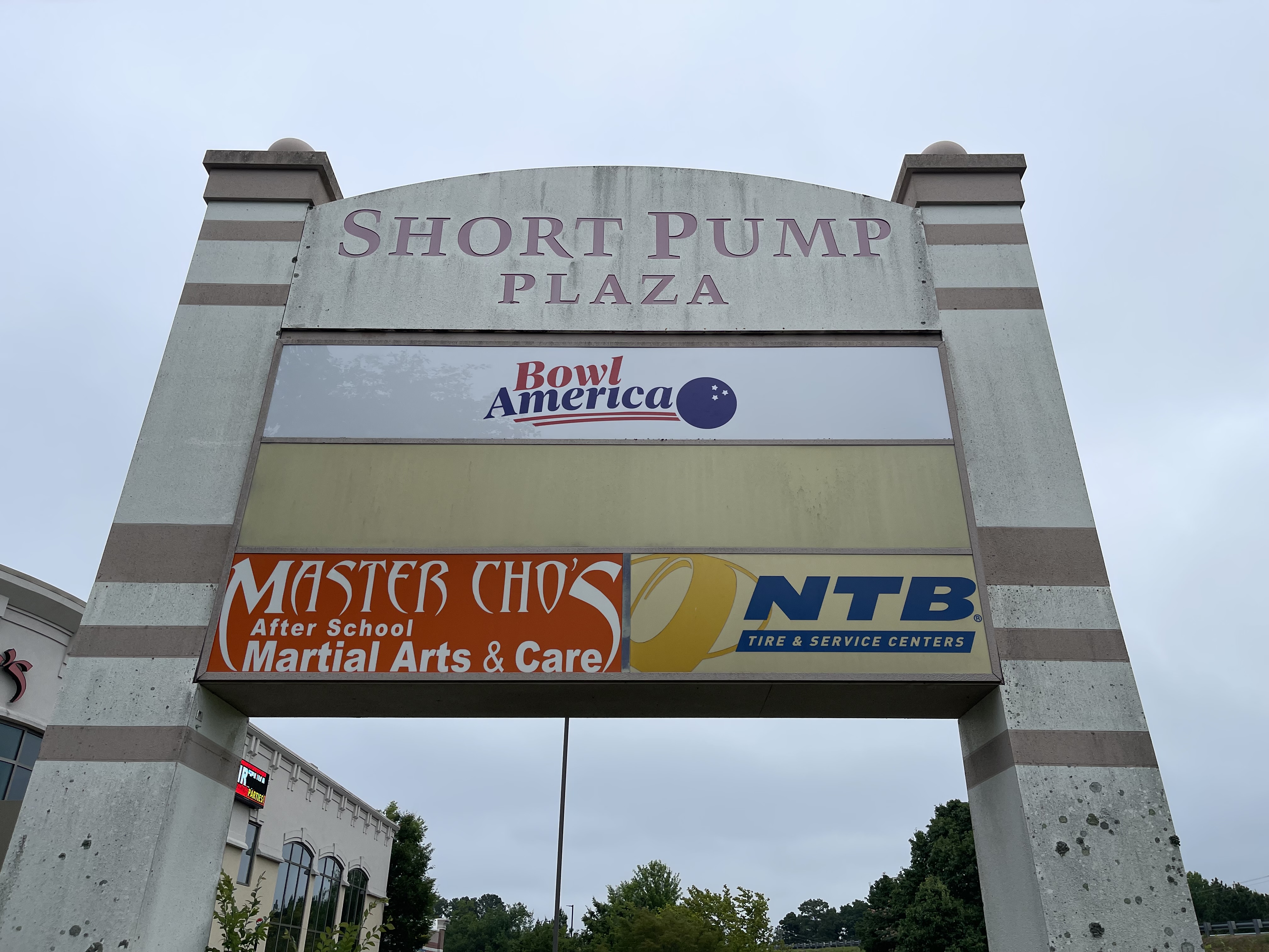
Richmond’s streets are a mix of wide boulevards and narrow alleys. For example, drivers glide through long, open stretches on Broad Street, squeeze into short sight windows near ramps on Belvidere, and stroll past storefronts in Carytown.
If you’re trying to nail the right letter height, this guide translates speed, distance, and approach angles so your custom signs are easy to read for people on the go.
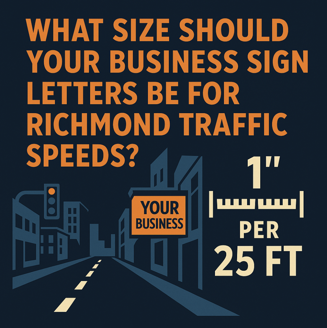
The rule that does 80% of the job
Start with the 25-feet-per-inch guideline. Also, consider how traffic actually moves on your street. For example, a posted 35 mph segment that flows at 57 mph is a considerable difference. No matter the specs, you need one-glance readability before the decision point.
Follow these tips for making adjustments:
- Speed & distance: If approach distance is short or speeds drift high, round up your letter height.
- Angles & clutter: Oblique approaches and busy sign fields push you to heavier strokes and cleaner backgrounds.
- Font reality: Thin or script letterforms need stroke help, a contrasting backer, or a modest size bump.
- Contrast & finish: Matte and high-contrast fields beat glossy, low-contrast combos in sun and glare.
-
What Richmond corridors really demand
In the city, drivers read at mid-to-high speed and often from an angle. Primary words deserve taller letters, heavier strokes, and simple phrasing. Near interchanges, sight windows shrink, so that means you need to cut the copy and boost letter height. On side streets, pedestrians are walking, so smaller letters work, but keep contrast strong and backgrounds quiet so storefront lines stay crisp.
Night matters as much as day
If your sign looks fine at noon but wrong after dark, the fix is adjusting color temperature and face materials.
Warm (~3000K), neutral (~4000K), and cool (~6500K) “whites” render brand colors differently. That means the wrong Kelvin shifts reds toward orange and blues toward purple. We bench-test bins through your actual faces so brand color matches the illumination.
Deep hues need illumination-rated translucent films, which are not the same as standard vinyl. For cabinets and on-prem digital billboards, second-surface graphics plus diffuser films tame harsh highlights and even out the field.
Tips if you’re going digital
Electronic message centers work best when type size, pixel pitch, and dwell time are balanced. Here’s the practical framework Richmond businesses can use:
- Pitch to setback: Tighter pitch for closer setbacks or standard pitch for deeper setbacks. The point is to always tie your choices to your real viewing distance.
- Dwell to speed: Use 3–8 seconds per slide with one idea per card.
- Creative & clarity: Go with bold type on flat backgrounds and avoid busy photos and thin outlines at speed.
Structure changes the sizing conversation
Monument signs in Richmond sit closer to the viewer, but landscaping and berms can mask reads. That’s why we suggest elevating the signage just enough and keep the main line short.
Pylon signs in Richmond buy distance but fight wind and glare, so with this option, you should go with larger letters, bolder strokes, and careful engineering.
Channel letters excel on facades along Broad and Hull when letter height, stroke, and lighting are correct.
How Branding Creative sizes copy for your exact block
With Branding Creative, LLC, we walk your approach from the driver’s lane, measure the first clean sight to decision point, shoot the angles, note speed drift and visual clutter, and prototype the night look. That’s why sign installation in Richmond with our team passes inspection and earns first-night readability. Our builds are UL/NEC-compliant and serviceable so maintenance is easy.
Repair vs. replace
A lot of “dim sign” complaints are diffusion or face issues. We can often solve them with polycarbonate face replacement by using illumination-rated films, diffuser film + LED spacing tweaks to remove banding, Kelvin re-binning to correct night color, and gasket refresh to keep moisture out. We always suggest sign repair in Richmond, VA instead of an expensive rebuild if it makes sense.
Permit & inspection considerations
Make sure your permit packed is in order. The City of Richmond requires:
- Zoning pre-check
- Scaled site plan
- Structural notes
- Electrical one-line and loads
- EMC addendum when needed
Branding Creative will handle this and more, including historic materials where required and schedule crane windows or after-hours tie-ins so installs don’t hijack your day.
About Branding Creative, LLC in Richmond
We’re a locally owned, family-operated, one-stop sign shop. As a trusted sign company in Richmond, VA, we design, fabricate, install, and service everything from channel letters to monuments, pylons, digital signage, custom LED displays, and scoreboards.
Ready Gain More Visibility for Your Richmond Business?
If you’ve been searching for “Richmond sign makers,” “custom signs in Richmond, VA,” or “commercial signs in Richmond, VA,” let’s put your brand where customers can’t miss it. We’ll design the sign you need to get your business seen throughout Richmond.
Call Branding Creative, LLC or get started now:
Free Richmond Zoning Check or Request a Permit-Ready Quote